Trained in design thinking, a relentless problem solver and a curious mind, I enjoy the look of calm and relief on people's faces when they know they have been heard, they are well informed, and they have achieved their goal...
...it is then that I know they are here to stay.
I design simple user experiences to gain trust and loyalty.


(mu)
without
(jirushi)
brand
+
=
OVERVIEW
Created a responsive web design for an existing retail presence
— MUJI, a Japanese retail store.
MUJI was founded in Japan in 1980 and offers a wide variety of good quality products including household goods, apparel and food. Mujirushi Ryohin, MUJI in Japanese, translates as “no-brand quality goods.”
MUJI has been credited with being 'resource-saving', 'low-priced', 'simple', 'anonymous' and 'nature oriented'.
There are more than 700 MUJI stores around the world, carrying more than 7,000 items.
- source, MUJI Website

HYPOTHESIS
ONLINE EXPERIENCE COULD BE STREAMLINED AS THE IN-STORE EXPERIENCE
While people enjoy exploring and buying the simple design aesthetics and quality product from MUJI stores, their experience browsing the website however leaves them often unable to locate a product and be overwhelmed by the cumbersome and inadequate checkout process.
This may turn users away from making a purchase online.


PROBLEM STATEMENT
Users would like to get a calm and organized shopping experience on MUJI’s website as they do when inside the MUJI stores. How might we streamline MUJI’s site to be intuitive like the stores.

USER RESEARCH
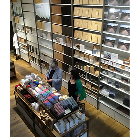
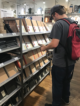
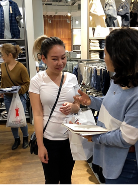
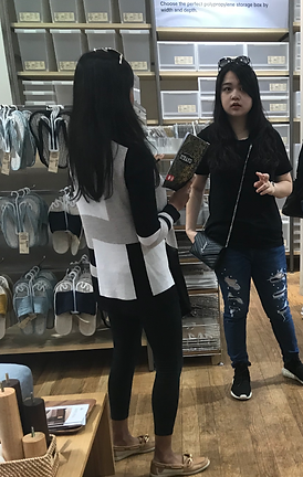
CONTEXTUAL INQUIRY
INSIGHT: Most customers coming into the store were looking for inexpensive, durable and tasteful merchandise. They were all interested in simple non-branded designs.
HEURISTIC EVALUATION
INSIGHT: Applied Abby Covert’s heuristics - There were critical problems in clarity, usefulness and findable measures of the site.
COMPETITIVE ANALYSIS
MUJI;s Competitors: Uniqlo, Ikea, Moleskin, Marimekko, H&M
Comparative Business: Trader Joe’s


OPPORTUNITY
1. Improve find ability of an item
2. Make checkout process more intuitive
PERSONA
ITRERATED FROM EXISTING PERSONA
CHANGES MADE;
tech empathy
description with cultural infusion
favored channels
REASONS WHY;
Contextual inquiries, Heuristic evaluation conveyed that;
+ persona has become more aware and enabled in using technology
+ want for quality and non-branded products seem to be becoming a need


IDEATION
1. Usability test on existing site - Desktop and Mobile
Users were given scenarios and tasks to 'find and item', ‘add item to cart’ and ‘proceed to checkout’. Level of difficulty in task completing was assessed.
2. Task Flows and User Flows
Users were given scenarios with tasks to 'find and item', ‘add item to cart’ and ‘proceed to checkout’. Level of difficulty in task completing was assessed.
3. Wireframes - Mid fidelity and High fidelity
Mid-fi wireframes followed up with Round-1 of usability testing and iteration.
Wireframes followed up with Round-2 of usability testing and re-iteration.

USABILITY TEST RESULTS
Usability test after Design Iteration
After Round2 of usability testing there was an increase in user satisfaction.
With the revisions that were made, users projected a general sense of accomplishment.
Task to checkout was accomplished on an average rate of completion at 0.24 sec/participant approximately.
NEXT STEPS
1. Further evolve the user insights for both Desktop and Mobile
+ To build a Object Oriented UX for the mobile information architecture.
+ Test Round3 of the reiterated Hi-Fi Wireframes
+ Build User Journeys based on revised iterations based and insights gathered in the usability testing.
2. Support improved KPI conversion rate
+ Improve click through rate by attracting millennials via social media; gauge their conversion rate.
+ To usability test ways improving user experience with strategies beyond the scope of checkout, thus to improve customer conversion rate with measurable KPI.
Example - Design a modal at Checkout for "5% OFF at checkout for rating the product" - gauge conversion rate.

